SaferActive Report 2: Scenarios
Institute for Transport Studies
Source:vignettes/report2.Rmd
report2.Rmd1 Introduction
This report outlines progress on the SaferActive project, which aims to provide a strong evidence base for interventions that simultaneously boost walking and cycling and greatly improve road safety. An overview of the project’s context and aims can be found at the open access project page github.com/saferactive/saferactive. This is the 2nd quarterly report, building on the 1st SaferActive report, published July 2020. Overall we have been working on the following areas:
- Development of the trafficalmr R package, adding functionality for cleaning and visualising road crash data (see saferactive.github.io/trafficalmr for details)
- Collecting and analysing data on cycling levels from the DfT’s traffic count data, recently updated to include 2019 data and undertaking spatio-temporal analysis of cycling resulting from these estimates, building on our work in Report 1 (Section 8), which provided geographic estimates of cycling uptake.
- Developing new methods for the geographic analysis and visualisation of road safety outcomes
- Exploring additional datasets to use as ‘explanatory variables’ to assess the impacts of different interventions
2 Software development
One of the objectives of the project was to develop software to enable access to data on traffic calming interventions.
We have progressed with the development of the trafficalmr package for reproducible road safety analysis, supporting the project and other projects on road safety.
We would like feedback from stakeholders: is it easy to use? what additional functionality would you like to see? The list of functions provided by the package can be found here: https://saferactive.github.io/trafficalmr/reference/index.html
3 Analysis of cycle counter data
We analysed the DfT’s manual traffic count data to explore its potential to provide estimates of the spatio-teamporal estimates of cycling levels — measured in km (or billion km, bkm, for compatibility with international road safety research) cycled per year — over time. A key component of this work was the expansion of the geographical scope from our London case study, to cover the whole of England, Wales and Scotland.
3.1 Year-to-year changes in the location and number of count points
Over the period 2000-2019, there is an uneven number of locations where annual average daily flow (AADF) estimates are available, as shown in Figure 3.1.
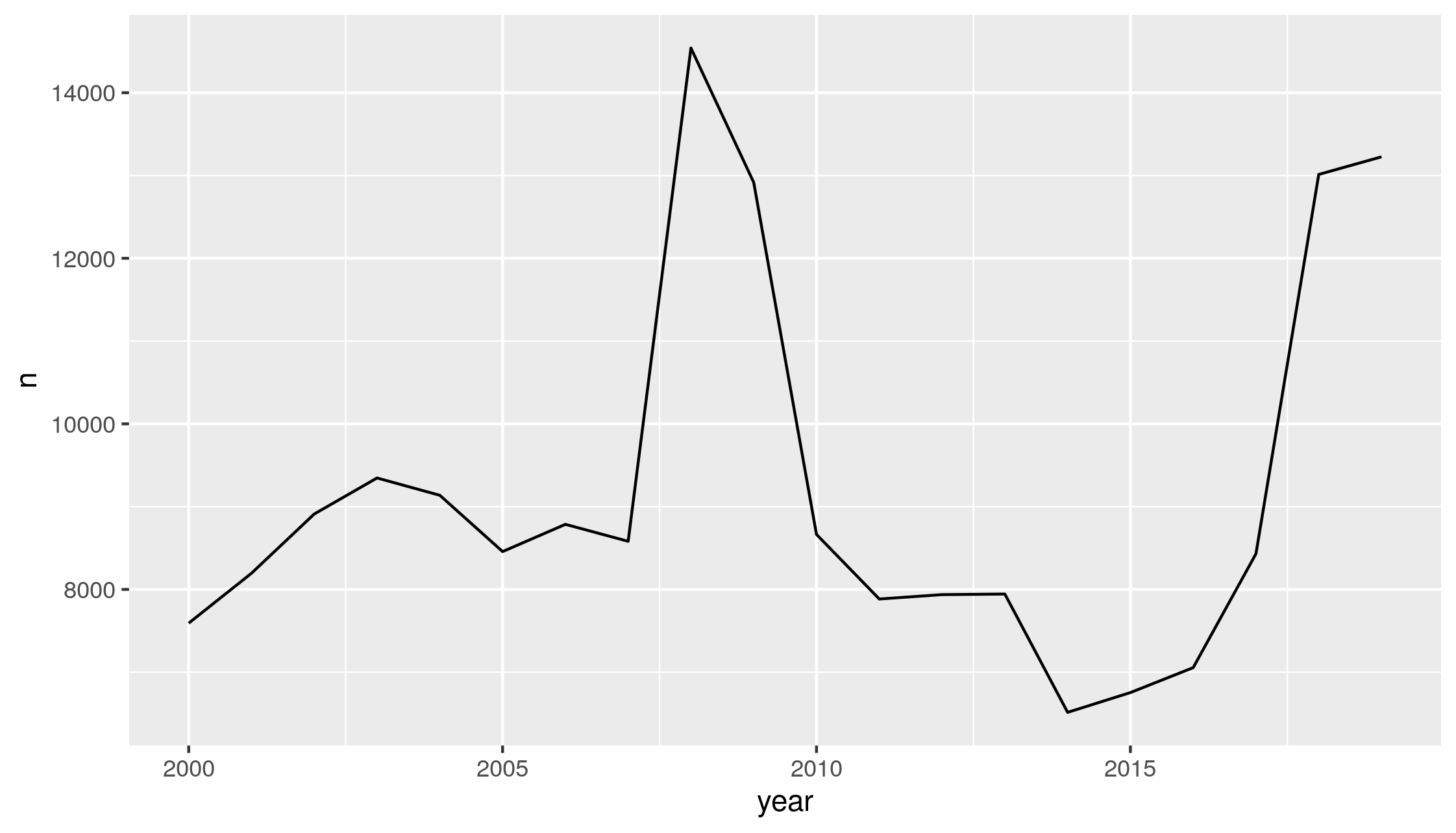
Figure 3.1: AADF counts per year in the DfT’s traffic counter dataset (left), and the number of annual surveys per count location (right)
Figure 3.1 reveals the number of count points has fluctuated from year to year, with over 14,000 count points in 2008, but less than 7000 counts in 2014. In addition, there has been a high degree of mobility of cycle count points over the last two decades. There are >2000 locations that have been sampled just once over the years 2000-2019, and >4000 locations that have been sampled in just two of these years. Relatively few locations have been sampled in more than 11 years. This flux in the number and location of count points makes it more difficult to assess changes in cycling uptake, because we do not have a consistent dataset from one year to the next. However, sampling location selection has been more consistent over the period 2010-2019 so we have focused our analysis on this ten-year period.
3.2 Road category and temporal trends in AADF
Over the years 2010 to 2019, there are 3,049 count locations which had continuous readings for each of these 10 years. This represents 35% of the total counts in these years. Taking solely these 3,049 count locations, we are able to generate estimates of cycling uptake at the local authority level which are fully independent of year-to-year changes in the location and type of roads chosen for cycle counts. These uptake estimates are presented, relative to 2011 cycling levels, in Figure 3.2, showing an upward trend in cycling uptake in the first half of the decade.
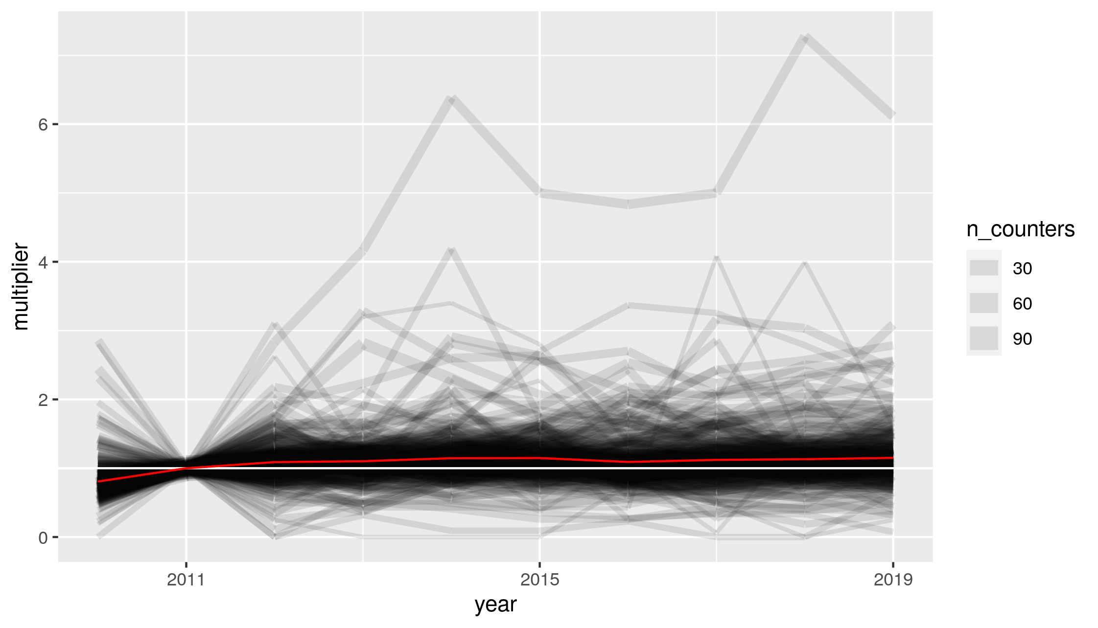
Figure 3.2: Cycling uptake estimates for all local authorities in Great Britain. Black line width represents the number of counters in each local authority, the white line represents no cycling uptake, and the red line is the weighted mean for all cycle counters from 2010 to 2019.
The mean AADF per year, for the years 2010-2019, is shown in Figure 3.3. We include three different estimates of mean AADF: across all 13,303 locations with at least two years of data, across the 5,895 locations with at least 5 years of sampling, and across the 3,049 count locations with complete annual data.
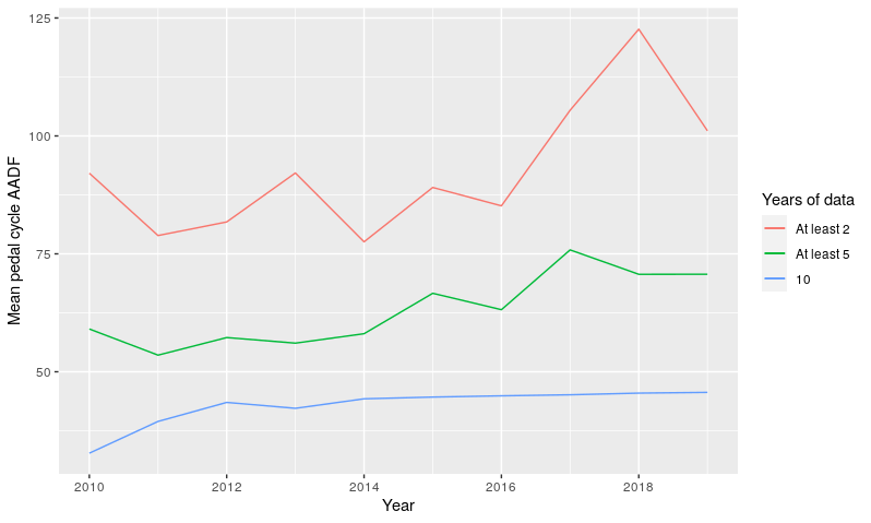
Figure 3.3: Mean annual average daily flows of pedal cycles 2010-2019, for count locations with at least 2 years, 5 years, and 10 years of counts across this time period
We can see that not only is the temporal trend different if we include a greater number of cycle count points, but the mean AADF is also higher. One reason for this is that counts are made on roads of a wide range of types. Of the count points with continuous readings in the years 2010-2019, 75% are on ‘C’ and unclassified roads, 24% on ‘B’ roads, and less than 1% on principal or trunk ‘A’ roads. By comparison, for all count points with at least two years of data during this period, 46% of counts are on ‘C’ and unclassified roads, 16% on ‘B’ roads, 29% on principal ‘A’ roads and 9% on trunk ‘A’ roads.
This is relevant because mean AADF varies greatly by road type. For count points with at least two years of data, mean AADF ranges from 217 on Principal ‘A’ roads to 71 on ‘B’ roads, 38 on ‘C’ and unclassified roads, and just 12 on Trunk ‘A’ roads.
For count points with complete annual data (Figure 3.4), the mean increase in cycling uptake during the years 2010-2014 closely corresponds with counts from minor roads (‘B’, ‘C’ and unclassified roads). However, mean AADF is highest on Principal ‘A’ roads at 214 cycles per day, and lowest on Trunk ‘A’ roads at 2.4 cycles per day. On Trunk ‘A’ roads, zero cyclists were recorded at 34% of counts; these may represent locations on major national routes that are unsuitable for most cyclists.
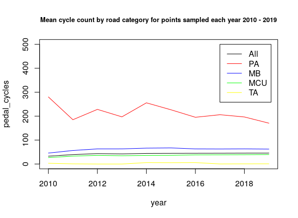
Figure 3.4: Mean annual average daily flows of pedal cycles by road category 2010-2019, for count locations with complete annual data across this time period. PA = Principal ‘A’ road; MB = ‘B’ road; MCU = ‘C’ or Unclassified road; TA = Trunk ‘A’ road.
The number of counts held on roads of different types also varies from year to year, although there is greater consistently in the decade 2010-2019 than in the previous decade. For count points with at least two years of data, Figure 3.5 shows the number of annual counts on roads of each type.
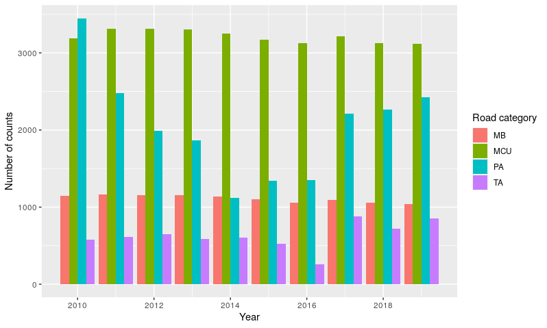
Figure 3.5: Number of count points on roads of different categories, for all locations with at least two years of count data 2010-2019
3.3 Mean normalised change in AADF at Local Authority level
As we have seen, the count point locations are not stable, and not all locations are surveyed every year. This presents difficulties when assessing change through time, since an apparent increase in cycling in a given year may simply be due to the selection of count points on busy roads that year.
To avoid problems associated with this, we assessed relative change at each count point, by calculating, for each year the point was surveyed, the relative divergence from the mean AADF across all years at that count point. Figure 3.6 shows these relative changes in weighted mean AADF, in the same way as absolute changes in AADF are shown in Figure 3.3.
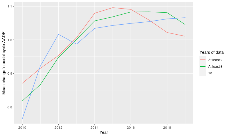
Figure 3.6: Weighted mean relative change in estimated pedal cycle AADF, for count locations with at least 2 years, 5 years, and 10 years of counts across this time period. Values are weighted by AADF.
We then calculated the mean of these values for each Local Authority and year, and normalised these around a baseline year of 2011.
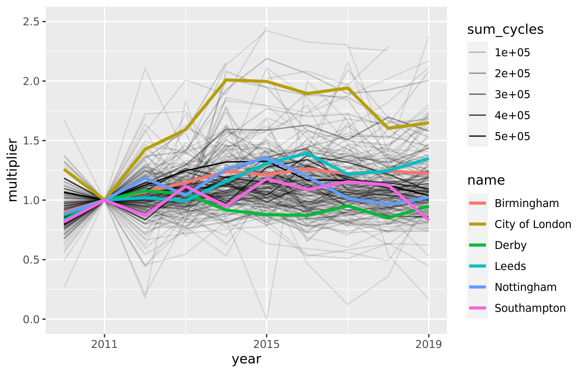
Figure 3.7: Relative change from a 2011 baseline in estimated pedal cycle AADF for each Local Authority. Line thickness represents the total number of pedal cycles surveyed (across all years) within the LA. Selected LAs are highlighted.
The results presented in Figure 3.7 can also be represented as an animated map, as shown in Figure 3.8. This provides an approximation of the relative change in cycling levels compared the the 2011 baseline, for which we have good data from the 2011 Census. The results shown if Figure 3.8 show that, according to DfT’s seasonally adjusted ‘AADF’ (annual average daily flow) dataset dataset, cycling has tended to grow in densly populated, cosmopolitan areas such as London (especially central north London boroughs), Bristol, Manchester and Leeds.
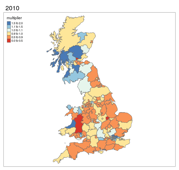
Figure 3.8: Animated map showing change in cycling levels relative to 2011 baseline.
3.4 Generalized Additive Models of AADF
Generalized Additive Models were chosen for their flexibility to accommodate non-linear trends in spatial and temporal variables, and the ability to include random effects within the model.
They also allow the production of easily interpretable partial effects for each model parameter.
We used the function bam() in the mgcv R package (Wood et al. 2014) which is specifically designed for use with large datasets as it is less computationally intensive than other methods.
The models currently use the absolute count data as the response variable, and follow a negative binomial error distribution with a log link function.
3.4.1 London model
Initially, GAM models were developed for London only. Using the raw hourly count data all cycle count points in London over the years 2010-2019, we produced a GAM model with smooth terms for year, day of the year, hour, space, road category, and an interaction term for year and space.
Preliminary results, based on a General Additive Model (GAM) are shown in Figure 3.9.
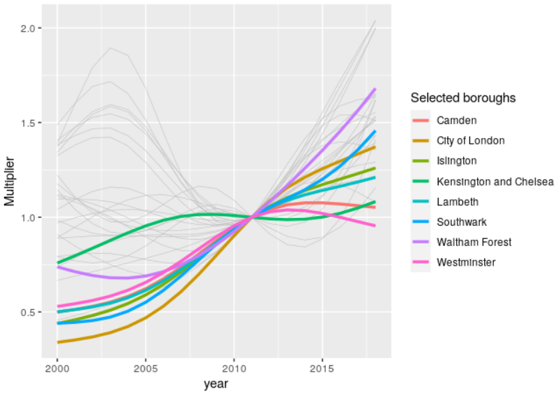
Figure 3.9: Preliminary estimates of cycling uptake in London boroughs relative to 2011 levels, 2000-2018. A selection of boroughs of interest are highlighted for reference.
3.4.2 National model
Building on results for London, we scaled-up the approach to provide nationwide spatio-temporal estimates of cycling. For the national GAM model we simplified the inputs, basing it on the AADF data rather than the raw hourly count data.
The model has smooth terms for the variables year, space and road category, each of which were found to be significant at p<0.05. This model uses all counts during the years 2010-2019, not just the counts from locations that were sampled every year. This allows us to make full use of the available data, with all road types represented.
The smooth term for year uses a cubic regression spline with 5 knots. The cubic spline utilises a low number of knots spread at even intervals through the range of parameter values. This helps to prevent overfitting.
British National Grid eastings and northings are represented in a duchon spline. This is a generalization of a thin plate spline (Duchon 1977; Wood 2003), which allows for two dimensional smoothing. We specified 100 knots for this spline, enabling the representation of complex spatial patterns in cycling levels across the UK.
Road category is included as a random effect in the model. Its inclusion is vital given that cycling levels vary greatly according to the type of road surveyed, and the number of counts from roads of each category varies from year to year.
The partial effects of year are shown in Figure 3.10.
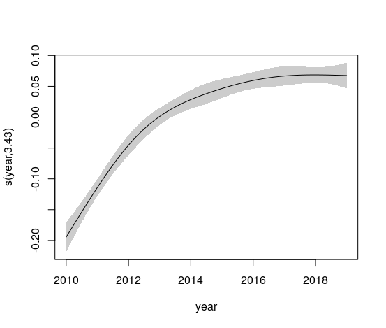
Figure 3.10: Partial effects of year in a national GAM model for cycle counts 2010-2019
The partial effects of space are shown in Figure 3.11.
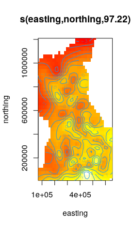
Figure 3.11: Partial effects of year in a national GAM model for cycle counts 2010-2019
3.5 Reliability of count data
The analysis above shows that the although the count data is ‘noisy’, it has potential to provide an indicator of relative change in cycling levels at regional to local authority levels. A next step, outlined in the final section of this report, is to assess how large the confidence intervals are associated with this dataset, by comparing the relatively sparse DfT count data with larger external datasets including TfL’s open cycle counter network data.
4 Geographic data analysis
Building on methods we initially developed for the CyIPT project, we developed new techniques for allocating crashes to features on the road network, such as junctions and road sections. Preliminary results comparing CyIPT results and results from this project are shown in Figure 4.1.
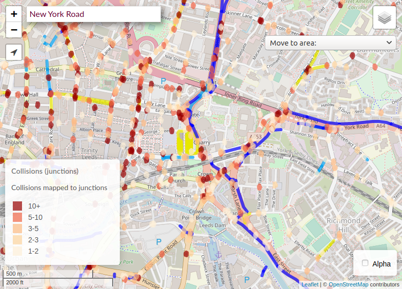
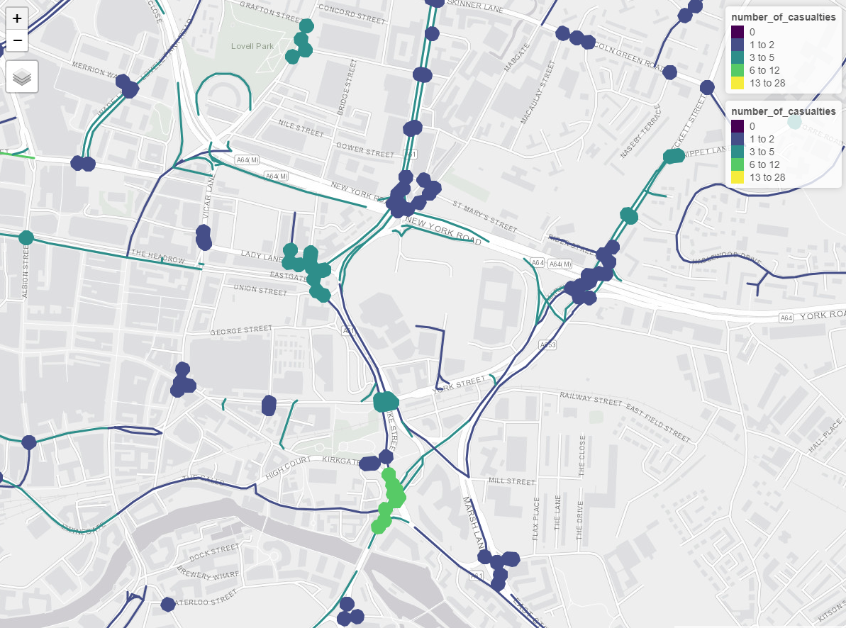
Figure 4.1: CyIPT methods for allocating crashes to juctions (left) compared with preliminary results of updated methods developed for the SaferActive project (right).
The objective of this part of the project is to increase to measure to level of risk of collisions at a very high level of spatial detail. Ideally we seek to use historical data to identify specific roads and junctions which are especially dangerous and thus need to be fixed.
The first stage of the process is to separate crashes which occurred at junctions, and those that did not. Junctions are a known “hotspot” for collisions thus should be treated separately from roads in general. Fortunately the stats19 data indicated whether a collision occurred at or near a junction. The second stage of the process it to simplify the road and junction network for analysis. This is a complex multistage process, but the overall objective is to reduce the road network so simple an easily comprehensible from by excluding and aggregating unnecessary details. For example, a single road will be represented within the OpenStreetMap as many geometries. For our purposes, a single line representing the main centreline of the road is sufficient. Thus small details just a turning lanes, or alleyways are removed and road segments are combined into a single linestring. Road segments are grouped by road name and reference allowing for “human legible” road units to be constructed. In the case of very long roads (over 1km) roads are broken into 500m sections.
Junctions are similarly simplified in a three stage process:
- All junction points are extracted from the input data (OSM in the case study example).
- Junction points are clustered together to reflect how we naturally think about junctions. For example, a roundabout is a single large junction not 4 - 10 small junctions arranged in a circle. Here a balance has to be struck between making the clusters large enough that big complex junctions are grouped together, while not being so large that densely packed urban streets become a single super-junction. We found a 15 metre buffer diameter to work well for coalescing junction clusters when focussing on relatively small case study areas (e.g. a single small local authority) and 30 m diameter for a larger study region (e.g. all or London), as shown in Figure 4.4.
- Associate the point crash data with the appropriate road or junction. Here we had to balance accuracy against performance. Measuring the distance between every crash and every road would take an inordinate about of time. We developed a computationally efficient solution, documented in the script
osm_cleaning.R.
A reproducible example showing how the junction identification method works is shown in the code chunk below, which starts by installing the trafficalmr package and uses a number of other functions developed for this project:
remotes::install_github("saferactive/trafficalmr")
library(trafficalmr)
road_data = tc_data_osm
nrow(tc_data_osm)
#> [1] 499
road_data_major = trafficalmr::osm_main_roads(road_data)
nrow(road_data_major) # find the main roads
#> [1] 125
road_data_junctions = osm_get_junctions(road_data_major)
road_data_clusters = cluster_junction(road_data_junctions, dist = 30)
plot(road_data$geometry, col = "grey")
plot(road_data_clusters, add = TRUE)
#> Warning in plot.sf(road_data_clusters, add = TRUE): ignoring all but the first
#> attribute
plot(road_data_junctions, add = TRUE)
plot(road_data_major$geometry, col = "black", add = TRUE)
Figure 4.2: Illustration of junction identification and OSM data cleaning methods.
Once matching is completed is it possible to map the number of crashes or casualties for each road and junction over the last 10 years.
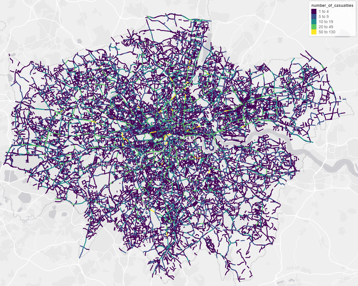
Figure 4.3: Preliminary maps of London roads showing number of casualties over the last 10 years from crashed not at junctions
The definition of a ‘junction’ depends on a number of factors, including the way that junctions are represented in the input data and, when aggregating nearby junction entities e.g. on a roundabout, the threshold distance beyond which two junctions are treated separately.
To do this in a reproducible way, the osm_get_junctions() function was developed, details of which can be found on the trafficalmr website at saferactive.github.io/trafficalmr.
The cluster_junctions() function was developed to cluster junctions.
Different geographic approaches for defining junctions using OSM data as an input are shown in Figure 4.4.
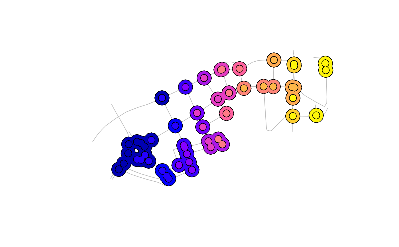
Figure 4.4: Junction clustering with 15m and 30m threshold distances (top) and illustration of an edge case in OSM data where junctions are not represented by a shared node (bottom)
5 Scenario development
We have considered a range of scenarios that we plan to implement in the next months. These are at a conceptual level but each could be implemented based on the data we have. Scenarios could be implemented either as ‘global’ scenarios, as implemented in the Propensity to Cycle Tool (Lovelace et al. 2017), as area-wide interventions or (more challenging) as specific intervention on specific roads (e.g. Chapeltown Road in Leeds becomes one way for motor traffic freeing-up space for a 2 way cycleway and increased space for walking).
- Traffic calming: the creation of traffic calming interventions of the type seen in the CID
- 20s Plenty: The roll-out of 20 mph zones in areas and local authorities
- Cycleways: The construction of protected cycleways in an area
- Low traffic: Reduction in traffic, e.g. due to congestion charge
- Oneway streets: the conversion of roads from 2 way to one way streets, e.g. as done in Torrington place
- LTNs: If every residential zone was a Low Traffic Neighbourhood
6 Next steps
We have a series of improvements and further investigations in progress or planning, that will be needed to reach the next stage of the project.
- Adapt the GAM models to use relative change in cycle counts, rather than the raw counts. This should improve the accuracy of the partial effects curves, enabling improved estimates of changes in cycle uptake through time and space.
- Use our annual Local Authority level estimates of exposure together with similar estimates of collision rates, to assess temporal and spatial changes in collision risk across the country. This is primarily analysed as KSI/bkm.
- Validate the cycle count-based exposure estimates, by comparing DfT counters with TfL counters for the years 2015-2019, for which TfL data are available.
- Develop case studies of the impact of various traffic calming or road safety measures, and use these to illuminate the scenarios described in the previous section.
- Launch our scalable web application.
7 References
Duchon, Jean. ‘Splines Minimizing Rotation-Invariant Semi-Norms in Sobolev Spaces’. In Constructive Theory of Functions of Several Variables, edited by Walter Schempp and Karl Zeller, 85–100. Lecture Notes in Mathematics. Berlin, Heidelberg: Springer, 1977. https://doi.org/10.1007/BFb0086566.
Wood, Simon N. ‘Thin Plate Regression Splines’. Journal of the Royal Statistical Society: Series B (Statistical Methodology) 65, no. 1 (2003): 95–114. https://doi.org/10.1111/1467-9868.00374.
Wood, Simon N., Yannig Goude, and Simon Shaw. ‘Generalized Additive Models for Large Data Sets’. Journal of the Royal Statistical Society: Series C (Applied Statistics) 64, no. 1 (2015): 139–55. https://doi.org/10.1111/rssc.12068.
Lovelace, Robin, Anna Goodman, Rachel Aldred, Nikolai Berkoff, Ali Abbas, and James Woodcock. 2017. “The Propensity to Cycle Tool: An Open Source Online System for Sustainable Transport Planning.” Journal of Transport and Land Use 10 (1). https://doi.org/10/gfgzf7.