SaferActive Report 1: Data
Institute for Transport Studies (ITS) University of Leeds
Source:vignettes/report1.Rmd
report1.Rmd1 Introduction
The report summarises progress on the SaferActive project, funded by the Department for Transport in support of aims outlined in the Cycling and Walking Investment Strategy (CWIS): to double the number of stages cycled compared with the baseline year of 2013, and “reverse the decline in walking” (Department for Transport 2017) whilst reducing the casualty rate per km walked and cycled year-on-year.
A follow-on report reviewed the safety elements of the CWIS, emphasising the importance of safety for enabling active travel and advocating measuring safety in terms of “the number of fatalities and serious injuries per billion miles” (Nathan 2019). In this report we outline methods of estimating safety in the more commonly used units of killed and seriously injured per billion km (KSI/bkm), and outline progress in collecting, analyising and modelling datasets that will be used in subsequent steps of the project.
Since the project’s inception in April 2020 we have also undertaken the following work to support road safety policies for active transport:
- Development of a new R package, trafficalmr, to automate the access and analysis of exposure data, casualty data and intervention data (see saferactive.github.io/trafficalmr for details)
- Collected and preprocessed data from a wide range of sources to support next steps in the project (see Section 6)
- Explored various geographic, interactive and static visualisation options, including who-hit-who visualisations using ‘upset plots’ (see Section 7)
- Analysed the variability of estimated walking and cycling risk per bkm (see Section 8)
- Created a prototype web app to visualise road safety data (see saferactive.github.io) as a basis for considering next steps in Section 9
2 Research landscape
A range of traffic calming measures can reduce casualty rates, a topic that has received much interest in the academic literature (e.g. Akbari and Haghighi 2020; Bunn et al. 2003; Zalewski and Kempa 2019; Zein et al. 1997; Bornioli et al. 2018). Recent papers have found strong evidence for ‘safety in numbers’ (increasing the argument for research into cycling uptake alongside road safety interventions) and the effectiveness of 20 mph speed limits for reducing risk to pedestrians (Aldred et al. 2018; Cook, Davidson, and Martin 2020). A major study by the DfT found evidence that ‘20 mph zones’ improved road safety (Maher 2018). Less attention has been paid to the question of how road safety measures can simultaneously reduce casualty rates and increase levels of cycling and walking (Brown, Moodie, and Carter 2017):
Limited evidence exists on secondary effects of investment in traffic calming and safety, including effects on rates of transport-related physical activity (active transport)
This suggests that there is a need for research that measures at least two outcomes from traffic calming and other road safety measures, that this project will investigate in parallel:
- Reduction in casualty rates
- Increase in active travel
3 Policy drivers
Objective 3 of the CWIS is to “reduce the rate of cyclists killed or seriously injured on England’s roads, measured as the number of fatalities and serious injuries per billion miles cycled.” Metrics to support this objective include: KSI/bkm, slight injuries per bkm, urban/rural/regional split of crashes, and proportion of cyclists/drivers stating that it’s too dangerous to cycle. There is no parallel target for pedestrian safety.
A rapid evidence assessment was commissioned by the Department for Transport in 2018 to identify promising intervention types in support of walking and cycling safety (NatCen 2018). Section 6.1, focusing on infrastructure and road signs interventions, found that there is evidence for the effectiveness of a range of interventions can be effective in reducing casualty rates, including ‘pedestrian refuge islands’, speed humps and speed cameras. Evidence was also reviewed of the effectiveness of cycleways, junction/roundabout design, signal controls, street lighting and ‘safe routes to school’. Section 6.2 found evidence of legislative changes, particularly speed limit reductions and expenditure on road safety policing. No UK-specific studies were identified.
A 2 year road safety action plan was set out in 2019, although the emphasis of this report was on education of drivers rather than traffic calming measures in the context of the CWIS (which is mentioned only once in the report), although the report does emphasise the importance of 20 mph zones (Department for Transport 2019a).
The CWIS Safety Review provides the most detailed government document to date on road safety measures specifically designed to support walking and cycling and contained much evidence and a number of case studies of effective interventions (Department for Transport 2018). Chapter 5 of this review focusses on infrastructure, with comments on cycling design guidance which have since been incorporated into the widely used Design Manual for Roads and Bridges in May 2020 (Highways England 2020). There are still no legally binding national standards for local authorities meaning that many cycleways do not meet guidance such as a 1.5 m minimum cycleway width.
An issue with the policy and research landscapes is that available evidence on road safety interventions is not easily actionable. An aim of this project is to make available evidence more actionable, while simultaneously generating more evidence of the effectiveness of different interventions.
4 Intervention types
A wide range of interventions can be undertaken to support road safety objectives. Interventions that have been mentioned in the research and policy contexts above are outlined below, with reference to data availability.
It is important to note that a wide range of interventions have safety impacts. Restricting the analysis to interventions specifically designed to improve safety could ignore the impact of potentially more important changes. We therefore classify interventions as those aiming to improve road safety and other interventions.
4.1 Road safety interventions
- Speed limit reductions include ‘20 mph limits’ (implemented only via signage) and ‘20 mph zones’ (which involve physical traffic calming measures and can include optional measures such as speed cameras) (Maher 2018; ROSPA 2019)
- Data on the prevalence of 20 mph zones can be obtained from OpenStreetMap, although it is not always clear when interventions took place.
- The Ordnance Survey has data on legal speed limits and real world traffic speeds and we are in conversation with them to obtain these datasets for use in our work.
- A related intervention is the installation of speed cameras.
- We are not aware of any national dataset on speed cameras that could be used for this study.
- Traffic Regulation Orders report interventions such as contraflow cycleways and other changes
- Data on TROs should be available open access from https://www.thegazette.co.uk
- The location and nature of physical traffic calming infrastructure, including various types of speed humps and raised junctions, plus a range of additional traffic calming measures (Department for Transport 2007). These can be obtained from multiple sources, including:
- Traffic calming infrastructure in OSM
- The Cycling Infrastructure Database in London
- Ordnance Survey Topo layer
4.2 Other types of intervention
Other interventions may not have been implemented primarily for road safety reasons, but may nevertheless reduce cycle and pedestrian casualty rates alongside other aims such as increasing cycling levels or reducing road traffic.
The installation of cycle superhighways or cycle lanes.
‘Filtered permeability’ interventions including point closures of roads, for example by rising and fixed bollards.
Larger scale interventions, including Mini-Holland schemes.
-
Again, data sources for these measures will include:
- TfL Cycling Action Plan
- Cycling infrastructure in OSM
- The Cycling Infrastructure Database in London
- Ordnance Survey Topo layer
The context is shown in graphs showing historic walking and cycling rates and casualty numbers visualised in the initial bid document which can now be seen at github.com/saferactive/, where we will host open data and code developed for the project.
5 Timelines
The project runs from April 2020 until the end of June 2021. Milestones are shown in the table below.
| Month | Date | Deliverable |
|---|---|---|
| 3 | 2020-07-24 | Report 1: on input data and methodology (delayed) |
| 6 | 2020-09-25 | Report 2: scenarios, workshop 1 and prototype web application to test |
| 9 | 2020-12-04 | Report 3: results and publication of open risk map data |
| 12 | 2020-03-05 | Final project report and end-of-project workshop |
| 15 | 2020-06-11 | Refined project web app pending feedback from workshop and stakeholders |
6 Data collection and processing
During the first three months of the project we have focussed on data collection, development of methods and descriptive data analysis/visualisation.
6.1 Obtaining traffic calming interventions from OSM
Data on traffic interventions were obtained from OSM, using the tag traffic_calming, as shown in Figure 6.1 and summarised in Table 6.1.
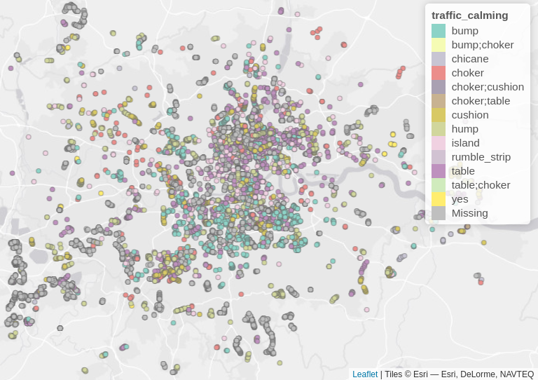
Figure 6.1: Map of traffic calming interventions in London from OSM.
| intervention | n | borough_with_most |
|---|---|---|
| bump | 1020 | Hammersmith and Fulham |
| chicane | 59 | NA |
| choker | 217 | Islington |
| cushion | 989 | Islington |
| hump | 1201 | Islington |
| island | 241 | Ealing |
| other | 56 | Richmond upon Thames |
| table | 1362 | Camden |
| NA | 7209 | Westminster |
6.2 Traffic calming and other intervention data from the CID
The Cycling Infrastructure Database (CID) provides rich, detailed and accurate information on cycling-related interventions across London. Of the 7 datasets in the CID, one is specifically focussed on traffic calming. An overview of the traffic calming measures it includes is shown below.
| Variable.name | Description | Number | Percentage |
|---|---|---|---|
| TRF_RAISED | Raised Table at junction | 2772 | 4.7 |
| TRF_ENTRY | Side Road Entry Treatment (i.e. raised in some way) | 7581 | 12.9 |
| TRF_CUSHI | Speed Cushions | 12626 | 21.6 |
| TRF_HUMP | Speed Hump | 33271 | 56.8 |
| TRF_SINUSO | Hump or cushion is sinusoidal | 6720 | 11.5 |
| TRF_BARIER | Barrier that cyclists can pass | 935 | 1.6 |
| TRF_NAROW | Chicane, narrowing, build-out or other horizontal deflection to traffic flow | 662 | 1.1 |
| TRF_CALM | Other traffic calming measure | 721 | 1.2 |
The results presented above highlight both the incomplete nature of OSM data and the quality of CID data. Given that there is no CID outside London and that Ordnance Survey data cannot readily be used in public-facing web tools, this suggests efforts to improve the quality of OSM data may be a worthwhile endeavour. Visual comparison of the 65,288 traffic calming features in the CID and 12,354 traffic calming interventions in OSM (a five fold difference) suggests that the two datasets do correspond reasonably well. Exploring the suitability of OSM vs CID vs OS data on traffic calming measures is a logical next step building on the preceding analysis.
6.3 Traffic regulation orders from The Gazette
Traffic Regulation Orders (TROs) are a legislative instrument used by local governments to make localised changes to the law to address transport issues. They are used for a wide range of purposes and include Experimental and Temporary orders which are especially important when responding rapidly to unforeseen changes. The date of introduction of TROs represents a vital clue to the implementation timelines of traffic calming measures. TROs are described in the House of Commons Briefing Paper CBP 6013, published in June 2020 (Butcher 2020):
Traffic Regulation Orders (TROs) are used by local councils to regulate traffic in their areas – this can be done by, for instance, temporarily or permanently stopping up a road to all or particular types of trafficand implementing parking restrictions. The reasons for doing this can be varied – to permit a road to be used for a parade, event or street party or to protect residents from ‘rat-running’ or to protect the road from the weight of heavy vehicles.
The main types of TRO are:
- Permanent TROs (PTROs), which must pass through four steps before they are approved (Preliminary requirements, Public objections and inquiries, Consent for certain schemes including speed limit reductions and Making and place a notice in the local press)
- Experimental TROs (ETROs) can be made without the same requirements for consultation as a PTRO, although ETROs can become permanent.
- Temporary TROs (TTROs) are time limited.
A Discovery project was funded to explore options for improving transparency and data access associated with TROs, resulting in a report recommending exploration of ways to provide open TRO data “in a consistent format that can be processed digitally” (GeoPlace 2020). An effort to unify TRO datasets across London has resulted in the website thegazette.co.uk. One option is to create an interface to the API to bulk download TRO data from this service, and we have created a prototype R package to explore this option at https://github.com/ITSLeeds/thegazetter.
6.4 Data on road speeds from OSM
We have developed functionality to bulk download OSM data with the maxspeed variable.
The results for all highways in OSM for London are shown below:
| max_speed | n |
|---|---|
| NA | 295290 |
| 20 mph | 52391 |
| 30 mph | 24814 |
| 40 mph | 3251 |
| 50 mph | 1589 |
| 60 mph | 1313 |
| 70 mph | 695 |
More prominent roads are most likely to have speed limit data, as shown in the plot below, which shows the roads that have meaningful speed limit values.

Figure 6.2: Speed limit data from OSM across all roads in London.
6.5 Data on 20 mph zones
One of the most effective interventions from a road safety perspective is 20 mph zones, according to UK based evidence. It would therefore make sense to identify 20 mph zones. One option would be to identify 20 mph zones from data at the road segment level, but we may require more data on where 20 mph zones have been implemented.
7 Visualisation
7.1 Interactive visualisation
We have explored visualisation options and we are using a state of the art R solution to power our production web application. The technicalities of the solution can be added somewhere else in the project but the solution is a modern front with a RESTful API which would mean the data is available for the users for transparency and reuse. The other scalable front end solution we are currently developing for the purpose of this project is inspired the smartphone ecosystem.
Figure 7.1: Using R to develop the fron-end using Turing eAtlas npm package
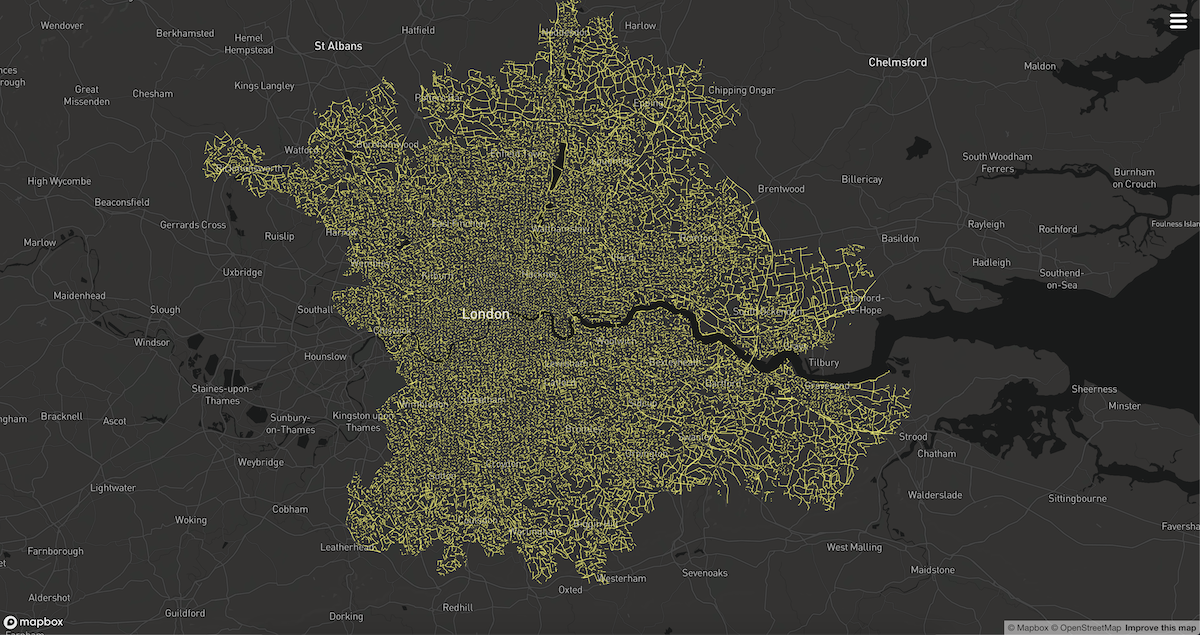
Figure 7.2: Using vector tiles to visualise large amounts of ata which can be cached and used offline in the browser and ability to interact with it
7.2 Heat map
Another option we have explored is ‘heatmap’ visualisations, as shown in a prototype web application currently hosted at https://saferactive.github.io/ and shown in Figure 7.3.
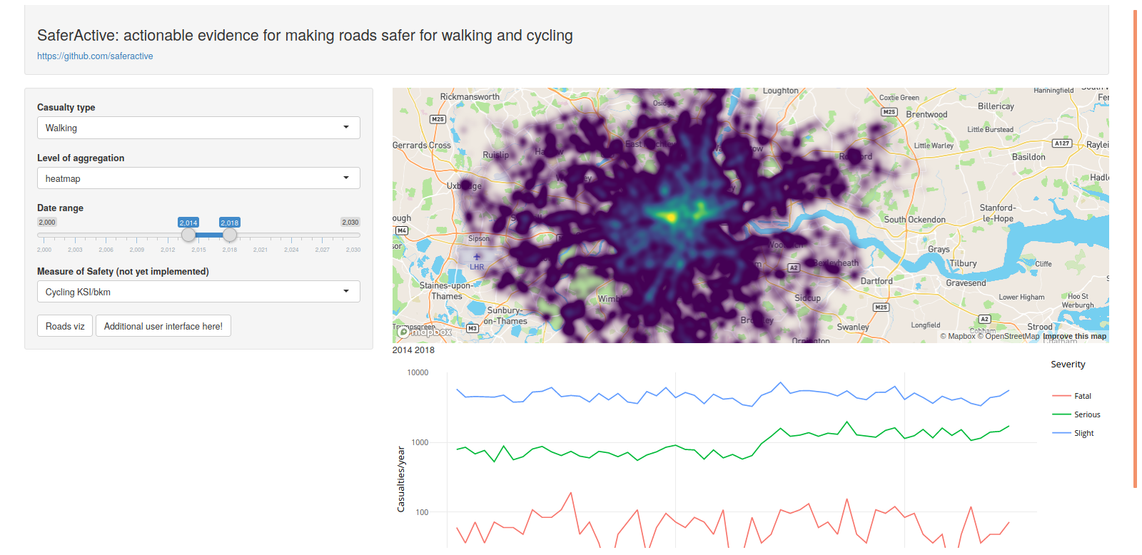
Figure 7.3: Prototype interactive visualisation of road crashes with a heatmap.
7.3 Who-hit-who
When studying road crash data, there is often detailed qualitative context that is important to analyse. For example, it may be desirable to explore the categories of traveler/vehicle types involved in collisions. A recent and successful example of a tool aimed at effecting such comparisons is who-hit-who. A screenshot appears in Figure 7.4, but this is essentially an interactive web-page displaying pair-wise frequencies of travelers/vehicle types involved in fatalities in the Netherlands. As part of our visualization design work, we will also explore incorporating these sorts of matrix views for characterizing crashes into our web-based visualization tool. For example, these sorts of summaries views could be introduced as dynamic legends (Meulemans et al. 2017), where the data displayed changes according to the spatial filter and zoom level of the main map view.

Figure 7.4: Screenshot taken from the who-hit-who tool.
There are nevertheless problems with these sorts of matrix views. They are not particularly space-efficient; most positions in the matrix above are empty. The matrix in Figure 7.4 does not immediately convey an order – it is necessary to perform some scanning of the rows and columns to identify the first, second and third most commonly occurring vehicle-to-vehicle combination. Additionally, the graphic considers only pairwise combinations of vehicle types; it is possible that some crashes may involve more than two categories of vehicle.
An alternative is Upset.
Upset plots organise co-occurring variables into discrete sets and summarises over the sets using bars, with an accompanying legend describing the composition of each set. In Figure 7.5, an example is applied to road crash data in England for 2018, accessed via the stats19 package (Lovelace et al. 2019). The plot has three components: the main bar chart shows each discrete combination of vehicle involved in crashes in the Stats19 dataset, ordered left-to-right according to frequency. Beneath this is a matrix clarifying what each combination represents, with vehicle combinations indicated via filled dots and emphasised with connecting lines.
By far the most common vehicle-to-vehicle combination is car-to-car. After this, collisions between cars and pedestrians, bicycles and motorcycles occur in reasonably large numbers. Notice that there are crashes involving more than two vehicle categories: most notable is car-van-HGV combination in column 8. With interaction it is possible to flexibly re-order upset plots, so rather than ordering according to intersection size, we may wish to order according to intersection degree – that is, the number of distinct vehicle types involved in a collision. Notice that in Figure 7.5, we have chosen to provide an additional summary graphic for each set intersection – in this case relative accident severity. The apparently high severity levels for set combinations towards the right-end of the graphic should be read cautiously as they are based on very low frequencies. However, a noticeable higher KSI rate (close to 50%) can be observed for crashes involving cars and HGVs.

Figure 7.5: Upset plot displaying vehicle combinations involved in crashes in 2018 in England. Source: Stats19.
8 Analysis
We have developed a methodology to estimate the casualty rate per billion km for walking and cycling.
Casualty data is available from stats19, broken down into fatal, serious and slight casualties. We have filtered these by mode of travel, identifying cyclist and pedestrian casualties.
To obtain KSI/bkm for cycle casualties, we have estimated the number of kilometers cycled in each London Borough. Using 2011 census data for travel to work and Cyclestreets.net ‘fast’ routing options, we create a route network. Each road segment within the route network is assigned to a London Borough based on its centroid location. Multiplying the number of cyclists using each segment by the length of the segment thus gives the number of km cycled within each Borough.
To obtain sufficient sample size we used stats19 casualty data for the years 2009 - 2013. However, our estimate of km cycled only covers one-way commuter journeys on a single day in 2011. Therefore we filter the stats19 data to include only accidents taking place during the rush hour peak periods (07:30-09:30 and 16:30-18:30) on weekdays. We then divided the number of casualties by two (to represent one-way journeys), then by five (to represent a single year) and again by 261 (to represent a single day).
Corrections were also made to account for changes in accident reporting systems. In recent years, many police forces across the UK have switched to injury based reporting systems. This has altered the proportions of casualties recorded as having ‘serious’ and ‘slight’ injuries. To control for these changes, casualty-level correction values were used, as recommended in (Department for Transport 2019b).
Initial results show some clear patterns (Figure 8.1). Cycling levels are highest in Inner London, with one-way commuter journey km cycled ranging from 58,410 km in Westminster to 1060 km in Harrow. Cycle casualties are also greatest in Inner London and mean annual adjusted KSI values for the period 2009-2013 (including weekday peak hour data only) range from 24.8 casualties per year in Westminster to 1.8 casualties per year in Barking and Dagenham.
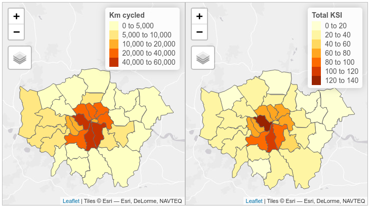
Figure 8.1: Total km cycled (one-way commuter journeys from 2011 census) and total KSI (2009 - 2013 weekday peak hours) using casualty severity adjustments for non-injury based reporting systems
There is a strong negative relationship between km cycled and KSI/bkm (Figure 8.2). Inner London Boroughs have greater km cycled and lower KSI/bkm, despite having a higher total number of casualties. By contrast, Outer London Boroughs have fewer km cycled and higher KSI/bkm. The results for slight injuries closely mirror those for serious injuries and fatalities.
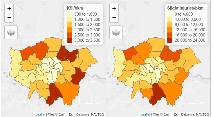
Figure 8.2: Cyclist KSI and slight injuries per bkm for London Boroughs 2009 - 2013
Further analyses will examine the nature of the relationship between km cycled and KSI/bkm. Initial findings suggest that this may be a exponential decay relationship, as seen in Figure 8.3.
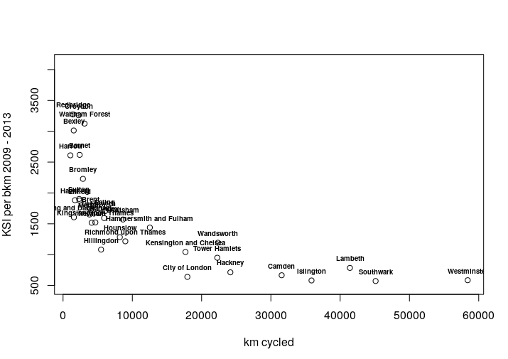
Figure 8.3: Relationship between KSI/bkm and number of km cycled in each Borough
8.1 Pedestrian casualties
Using a similar method, we have estimated walking levels per Borough based on travel to work 2011 census data. Trips are routed using the Cyclestreets.net fast route algorithm. However, we expect this to be less accurate than our measure of cycling levels, due to the high proportion of walking trips that are for purposes other than commuting. Future work will investigate other data sources to improve our estimation of walking levels.
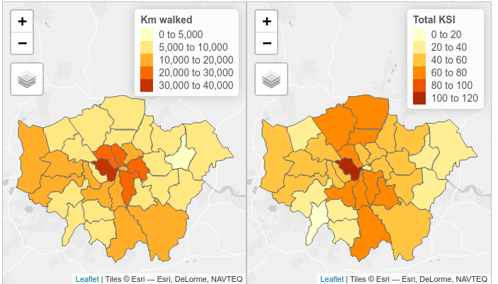
Figure 8.4: Total km walked (one-way commuter journeys from 2011 census) and total KSI (2009 - 2013 weekday peak hours) using casualty severity adjustments for non-injury based reporting systems
Levels of walking to work are unsurprisingly highest in Boroughs close to Central London (Figure 8.4), reaching 39,700 km (for one-way commuter journeys) in Westminster. Meanwhile, KSI/bkm peaks at 23.2 casualties per year in Westminster.
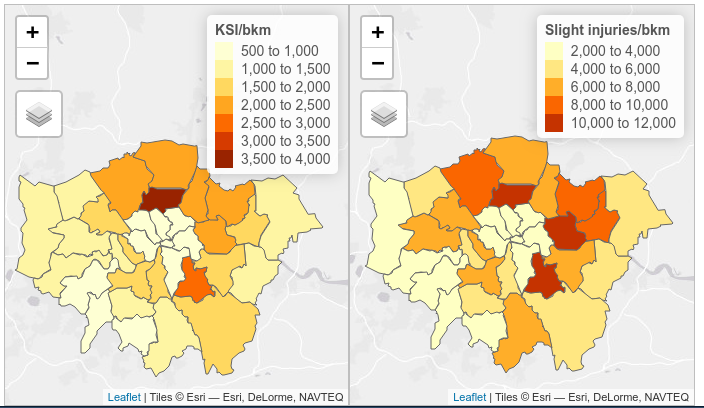
Figure 8.5: Pedestrian KSI and slight injuries per bkm for London Boroughs 2009 - 2013
Continuing to use the weekday peak hour data, a higher proportion of pedestrian casualties suffer serious injuries or fatalities compared to cycle casualties. For pedestrians, 25.9% of casualties are serious or fatal, but for cyclists this figure is only 19.1%. The mean KSI/bkm walked, at 1430, is similar the mean KSI/bkm cycled, at 1610, although the figure for pedestrians in particular may be artificially raised by the exclusion of non-commuter journeys.
The highest rates of KSI/bkm and slight injuries per bkm for pedestrians are found to be in the outermost Inner London Boroughs, such as Haringey, Lewisham and Newham (Figure 8.5). However, we expect that this may be an artefact of the fact that travel to work has been used as a proxy for total km walked. These Boroughs may have high levels of walking overall, but relatively low levels of walking to work since they are not within walking distance of Central London. This requires further investigation.
9 Next steps
Overall the next step is to move from collection and exploratory analysis of data towards modelling scenarios of change and visualisation.
We envisage the following high level outputs:
- estimates of the combined active travel uptake and safety impacts of major interventions to estimate the impacts of future changes
- creating new ways to visualise active travel uptake and road safety data in a single place
- development of software tools such as
trafficalmrto support other to use datasets related to exposure, casualty and intervention data
More specifically, the following actions and strategies will inform our work over the next reporting period:
Keep a balance between the three main dataset types of exposure data (estimated cycling and walking levels), casualty data and traffic calming intervention data. The interaction between these three factors is our core area of interest.
Investigate relationships between the Index of Multiple Deprivation and casualty rates, in particular pedestrian casualties.
Use DfT road traffic statistics to estimate changes in cycling uptake through time, along with any other datasets that are available.
Work to improve estimates of walking levels, including through use of NTS data.
Continue using London as a case study, but focus on methods that can be generalised to extend the analysis to the rest of the country. This means assessing the quality of OSM traffic calming data by comparison with the CID or Ordnance Survey. Work on solving data licensing issues with OS data, as this would provide an excellent national data source.
If DfT is able identify data on 20mph zones this will be very beneficial e.g. digitised versions of the maps shown in Maher (2018) (Appendix 1)?. Otherwise, we will investigate the possibility of digitising this data.
Develop R functions to extract London TRO data from The Gazette, to provide vital information on the date of implementation of traffic calming measures. Further investigate how to access TRO data from outside London when TRO data systems are rolled-out nationwide.
Continue to work on multiple types of output. This will include data visualisation such as who-hit-who upset plots, software development, method development and data analysis.
Analysis at a range of temporal and geographical scales, with data volume determining the highest resolution we can reach or the format of the outputs at high geographic resolutions.
10 References
Akbari, Ali, and Farshidreza Haghighi. 2020. “Traffic Calming Measures: An Evaluation of Four Low-Cost TCMs’ Effect on Driving Speed and Lateral Distance.” IATSS Research 44 (1): 67–74. https://doi.org/10/gkb5qj.
Aldred, Rachel, Anna Goodman, John Gulliver, and James Woodcock. 2018. “Cycling Injury Risk in London: A Case-Control Study Exploring the Impact of Cycle Volumes, Motor Vehicle Volumes, and Road Characteristics Including Speed Limits.” Accident Analysis & Prevention 117 (August): 75–84. https://doi.org/10/gdwb2b.
Bornioli, Anna, Isabelle Bray, Paul Pilkington, and Emma L. Bird. 2018. “The Effectiveness of a 20 Mph Speed Limit Intervention on Vehicle Speeds in Bristol, UK: A Non-Randomised Stepped Wedge Design.” Journal of Transport & Health 11: 47–55. https://doi.org/10/gkb5n6.
Brown, V., M. Moodie, and R. Carter. 2017. “Evidence for Associations Between Traffic Calming and Safety and Active Transport or Obesity: A Scoping Review.” Journal of Transport & Health 7: 23–37. https://doi.org/10/gctxsg.
Bunn, Frances, T. Collier, C. Frost, Katharine Ker, I. Roberts, and R. Wentz. 2003. “Traffic Calming for the Prevention of Road Traffic Injuries: Systematic Review and Meta-Analysis.” Injury Prevention 9 (3): 200–204. https://doi.org/10/cjwdsm.
Butcher, Louise. 2020. “Traffic Regulation Orders (TROs).” BRIEFING PAPER CBP 6013. House of Commons Library.
Cook, Rob, Peter Davidson, and Rosie Martin. 2020. “Twenty Miles Per Hour Speed Zones Reduce the Danger to Pedestrians and Cyclists.” BMJ: British Medical Journal (Online) 368.
Department for Transport. 2007. Traffic Calming. Local Transport Note, 1/07. London: TSO.
———. 2017. “Cycling and Walking Investment Strategy.” London: Department for Transport.
———. 2018. “Cycling and Walking Investment Strategy (CWIS) Safety Review.”
———. 2019a. “Road Safety Statement 2019: A Lifetime of Road Safety.” Department for Transport.
———. 2019b. “Annex: Update to Severity Adjustments Methodology.”
GeoPlace. 2020. “TRO Discovery.”
Highways England. 2020. “CD 195 - Designing for Cycle Traffic - DMRB.” Highways England.
Lovelace, Robin, Malcolm Morgan, Layik Hama, and Mark Padgham. 2019. “Stats19: A Package for Working with Open Road Crash Data.” Journal of Open Source Software. https://doi.org/10/gkb498.
Maher, Mike. 2018. “20mph Research Study.” Department for Transport.
Meulemans, Wouter, Jason Dykes, Aidan Slingsby, Cagatay Turkay, and Jo Wood. 2017. “Small Multiples with Gaps.” IEEE Transactions on Visualization and Computer Graphics 23 (1): 381–90. https://doi.org/10/f92gd5.
NatCen. 2018. “Cycling and Walking Safety Rapid Evidence Assessment.” Department for Transport.
Nathan, Jai. 2019. “The Cycling and Walking Investment Strategy (CWIS) Safety Review.” Department for Transport.
ROSPA. 2019. “A Guide to 20mph Limits.” The Royal Society for the Prevention of Accidents.
Zalewski, Andrzej, and Jan Kempa. 2019. “Traffic Calming as a Comprehensive Solution Improving Traffic Road Safety.” In IOP Conf. Ser. Mater. Sci. Eng, 471:062035. https://doi.org/10/gkb5qk.
Zein, Sany R., Erica Geddes, Suzanne Hemsing, and Mavis Johnson. 1997. “Safety Benefits of Traffic Calming.” Transportation Research Record 1578 (1): 3–10. https://doi.org/10/bm5h2t.